

There’s something especially rewarding about helping bring a new business to life — especially one with a clear, values-driven mission. I recently had the privilege of developing the branding and business card design for Wild Root Haven Properties, Keri Matschullat's exciting new real estate investing venture.
This project wasn’t just about designing a business card or picking pretty colors. It was about expanding the existing logo designed by Meg at Wet Owl Studio and creating a brand identity that reflects resilience, growth, and a vision for positive community impact.
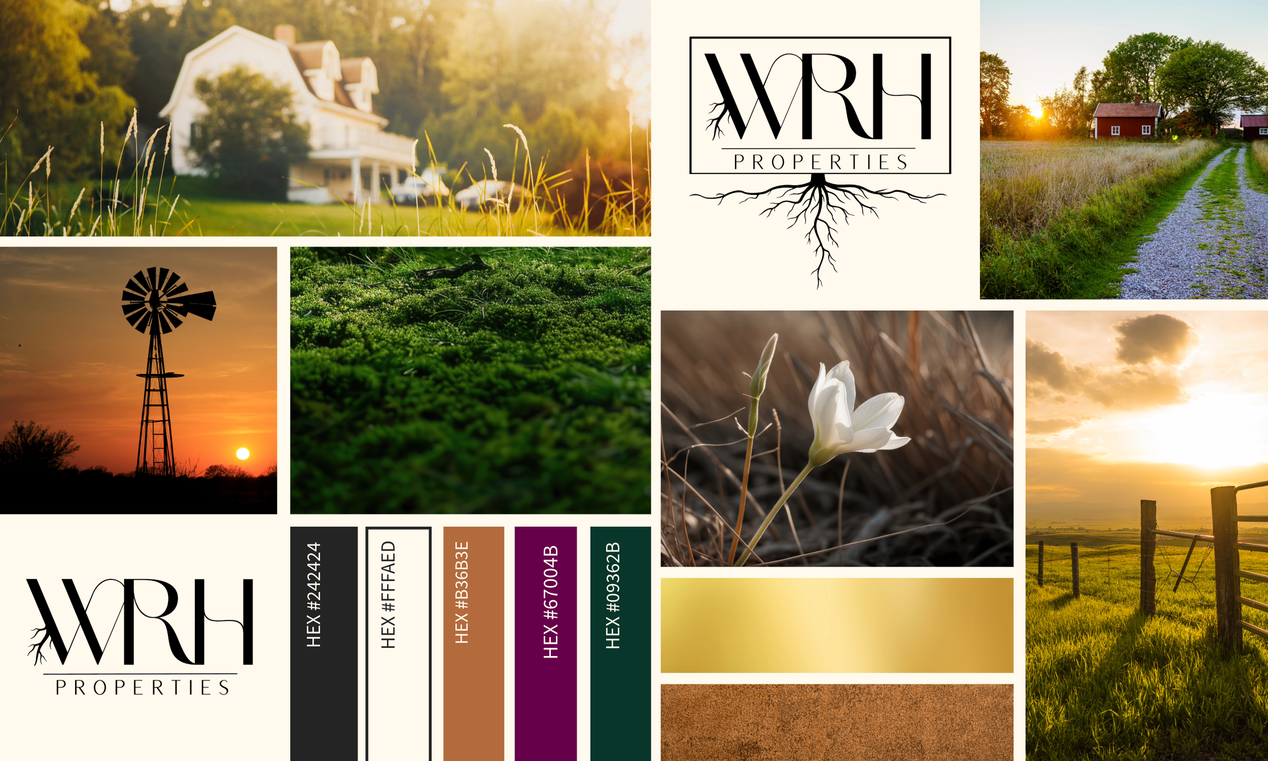
The Story Behind Wild Root Haven Properties
The name Wild Root Haven beautifully encapsulates the company’s mission: “nurturing potential where others see weeds.” It symbolizes the beauty of untamed growth, the strength found in deep roots, and the creation of safe, welcoming spaces.
Wild Root Haven Properties invests with heart, focusing on ethical, thoughtful real estate projects that prioritize people as much as profit. That spirit became the North Star guiding every design decision — from the color palette to the typography to the overall feel.
The Branding Process: Color, Typography & Feel
I focused on extending the logo’s style to encompass the entire brand and made sure it would work across digital and print materials.
We leaned into a color palette of deep greens and rich purples — tones that are earthy and calming, but also distinctive in the real estate space. Green connects to nature, growth, and stability, while purple adds an unexpected touch of creativity and sophistication.
For typography, I chose a clean, modern sans-serif paired with elegant serif accents. This combo strikes a balance between professional and approachable, making the brand feel both trustworthy and warm.
But it’s the overall vibe that ties it all together: the brand needed to feel grounded, human, and intentional — not flashy or overly corporate. Wild Root Haven isn’t about aggressive flipping or faceless investing. It’s about thoughtful stewardship, community improvement, and seeing beauty where others might overlook it. Every design choice was made to echo that philosophy, from generous whitespace to organic shapes to layouts that invite genuine connection.
Business Card Design: First Impressions That Last
We landed on two business card versions (couldn't pick just one!): one in a sophisticated green palette and another in a rich purple tone. Both showcase the Wild Root Haven logo on the front with a clean, spacious layout that feels modern yet warm.
On the back, Keri’s name, title, and contact details are laid out with clarity and room to breathe — no clutter, just intentional design. The cards are meant to spark meaningful conversation and leave a memorable impression, perfectly aligned with the brand’s personality.
We ordered the final cards through Moo.com — my go-to for premium business cards that always impress. Plus, Keri can reorder another pack of cards with one click! If you’re curious, here’s my affiliate link for 25% off.


Designing for Purpose-Driven Brands
This project reminded me why I love branding work: it’s not just about making something look good; it’s about making it mean something.
Every element — from color to type to feel — was selected to reflect Wild Root Haven’s commitment to people-centered investing. The end result is a brand identity system that’s authentic, grounded, and ready to grow.
I’m always excited to partner with founders who want their brand to reflect their heart — reach out if that’s you.


-1.png?width=352&name=Untitled-3%20(3)-1.png)
Leave a Comment